Python สำหรับ Data Analytics: Matplotlib, Seaborn และการสร้างภาพข้อมูลสำหรับการสัมภาษณ์งาน
เชี่ยวชาญการสร้างภาพข้อมูลด้วย Python ผ่าน Matplotlib และ Seaborn บทเรียนเชิงปฏิบัติครอบคลุมกราฟ การจัดรูปแบบ subplot และคำถามสัมภาษณ์ที่พบบ่อยสำหรับตำแหน่ง data analytics ปี 2026

การสร้างภาพข้อมูลด้วย Python ถือเป็นหนึ่งในทักษะที่ถูกทดสอบมากที่สุดในการสัมภาษณ์งานสาย data analytics ผู้สัมภาษณ์คาดหวังให้ผู้สมัครสามารถสร้างกราฟที่สะอาดและอ่านง่ายจากข้อมูลดิบ รวมถึงอธิบายเหตุผลในการเลือกการออกแบบได้อย่างมั่นใจ
บทเรียนนี้ครอบคลุม Matplotlib 3.10 และ Seaborn 0.13 ซึ่งเป็นสองไลบรารีที่ครองตำแหน่งสำคัญในการสัมภาษณ์เชิงเทคนิคสำหรับตำแหน่งนักวิเคราะห์และ data scientist ทุกตัวอย่างโค้ดสามารถรันได้ทันทีบน Python 3.12+
การสัมภาษณ์งาน data analytics ส่วนใหญ่จะมีรอบ live coding ที่ผู้สมัครต้องสร้างภาพข้อมูลจากชุดข้อมูลภายในเวลาไม่เกิน 15 นาที รูปแบบด้านล่างนี้สอดคล้องโดยตรงกับแบบฝึกหัดเหล่านั้น
การตั้งค่าสภาพแวดล้อมสำหรับการสร้างภาพข้อมูลด้วย Python
ก่อนเขียนโค้ดกราฟใดๆ สภาพแวดล้อมการพัฒนาจำเป็นต้องมี dependency ที่เหมาะสม Virtual environment ที่สะอาดช่วยหลีกเลี่ยงปัญหาความขัดแย้งของเวอร์ชันระหว่าง Matplotlib, Seaborn และพื้นฐาน NumPy/Pandas ที่ใช้ร่วมกัน
# setup.sh
python -m venv venv
source venv/bin/activate
pip install matplotlib==3.10.8 seaborn==0.13.2 pandas numpy
ตรวจสอบอย่างรวดเร็วเพื่อยืนยันว่าทุกอย่างทำงานได้:
# verify_install.py
import matplotlib
import seaborn as sns
import pandas as pd

print(f"Matplotlib: {matplotlib.__version__}")
print(f"Seaborn: {sns.__version__}")
print(f"Pandas: {pd.__version__}")
เมื่อ dependency ทั้งหมดถูกล็อกแล้ว ขั้นตอนถัดไปจะเน้นที่พื้นฐานของ Matplotlib ซึ่งเป็นรากฐานสำหรับกราฟ Seaborn ทุกชนิด
พื้นฐาน Matplotlib: Figure, Axes และ API แบบ Object-Oriented
Matplotlib มี API สองแบบ: state machine ของ pyplot และอินเทอร์เฟซแบบ object-oriented (OO) API แบบ OO ให้การควบคุมที่ชัดเจนสำหรับทุกองค์ประกอบ และเป็นมาตรฐานที่คาดหวังในโค้ดระดับมืออาชีพและการสัมภาษณ์
# bar_chart_oo.py
import matplotlib.pyplot as plt
import numpy as np

# Sample quarterly revenue data
quarters = ["Q1", "Q2", "Q3", "Q4"]
revenue = [42_000, 58_000, 51_000, 67_000]

# Create figure and axes explicitly
fig, ax = plt.subplots(figsize=(8, 5))

# Draw bars with a specific color
ax.bar(quarters, revenue, color="#2563eb", width=0.5)

# Label axes clearly — interviewers check for this
ax.set_xlabel("Quarter")
ax.set_ylabel("Revenue (USD)")
ax.set_title("Quarterly Revenue — 2025")

# Format y-axis with dollar amounts
ax.yaxis.set_major_formatter(plt.FuncFormatter(lambda x, _: f"${x:,.0f}"))

# Remove top and right spines for a cleaner look
ax.spines[["top", "right"]].set_visible(False)

plt.tight_layout()
plt.savefig("quarterly_revenue.png", dpi=150)
plt.show()
รายละเอียดสำคัญที่ผู้สัมภาษณ์สังเกต: การสร้าง fig, ax อย่างชัดเจนแทนการใช้ plt.plot() ป้ายกำกับแกนที่อ่านง่าย ค่า tick ที่จัดรูปแบบแล้ว และการลบองค์ประกอบกราฟที่ไม่จำเป็น (spines ที่เกินมา) ตัวเลือกเล็กๆ เหล่านี้แสดงถึงแนวคิดระดับ production
การสร้าง Subplot สำหรับการวิเคราะห์เชิงเปรียบเทียบ
การสัมภาษณ์มักต้องการให้เปรียบเทียบหลายเมตริกแบบเคียงข้างกัน ฟังก์ชัน subplots() จัดการเรื่องนี้ด้วยเลย์เอาต์แบบกริด
# subplots_comparison.py
import matplotlib.pyplot as plt
import numpy as np

months = ["Jan", "Feb", "Mar", "Apr", "May", "Jun"]
users = [1200, 1350, 1500, 1420, 1680, 1820]
revenue = [24_000, 27_000, 30_000, 28_400, 33_600, 36_400]

# Two side-by-side plots sharing the x-axis
fig, (ax1, ax2) = plt.subplots(1, 2, figsize=(14, 5), sharey=False)

# Left panel: user growth as a line chart
ax1.plot(months, users, marker="o", color="#2563eb", linewidth=2)
ax1.set_title("Monthly Active Users")
ax1.set_ylabel("Users")
ax1.spines[["top", "right"]].set_visible(False)

# Right panel: revenue as a bar chart
ax2.bar(months, revenue, color="#16a34a", width=0.5)
ax2.set_title("Monthly Revenue")
ax2.set_ylabel("Revenue (USD)")
ax2.yaxis.set_major_formatter(plt.FuncFormatter(lambda x, _: f"${x:,.0f}"))
ax2.spines[["top", "right"]].set_visible(False)

fig.suptitle("Product Metrics — H1 2025", fontsize=14, fontweight="bold")
plt.tight_layout()
plt.savefig("product_metrics.png", dpi=150)
plt.show()
การใช้ sharey=False ช่วยให้แต่ละ panel มีสเกลของตัวเอง เนื่องจากรายได้เป็นหน่วยดอลลาร์และจำนวนผู้ใช้เป็นตัวเลขนับที่มีขนาดต่างกัน ฟังก์ชัน suptitle เพิ่มหัวข้อหลักเหนือ subplot ทั้งสอง
ผู้สมัครมักใช้ plt.plot() สำหรับทุกสถานการณ์แทนที่จะใช้ API แบบ object-oriented เมื่อผู้สัมภาษณ์ขอให้เพิ่มแกน y ที่สองหรือปรับแต่ง subplot เดียว วิธี pyplot จะไม่สามารถรองรับได้ ควรใช้ fig, ax = plt.subplots() เป็นค่าเริ่มต้นเสมอ
กราฟสถิติของ Seaborn: จากการกระจายตัวถึงสหสัมพันธ์
Seaborn สร้างขึ้นบน Matplotlib และเชี่ยวชาญด้านการสร้างภาพข้อมูลเชิงสถิติ ในขณะที่ Matplotlib ต้องการการตั้งค่าด้วยตนเอง Seaborn จะอนุมานค่าเริ่มต้นที่เหมาะสมจากโครงสร้างข้อมูลโดยอัตโนมัติ
การวิเคราะห์การกระจายตัว ซึ่งเป็นหนึ่งในงานสัมภาษณ์ที่พบบ่อยที่สุด ต้องการเพียงการเรียกฟังก์ชันเดียว:
# distribution_analysis.py
import seaborn as sns
import matplotlib.pyplot as plt
import pandas as pd
import numpy as np

# Simulate salary data for two departments
np.random.seed(42)
data = pd.DataFrame({
    "salary": np.concatenate([
        np.random.normal(75_000, 12_000, 200),  # Engineering
        np.random.normal(65_000, 10_000, 150),  # Marketing
    ]),
    "department": ["Engineering"] * 200 + ["Marketing"] * 150
})

# KDE plot comparing salary distributions
fig, ax = plt.subplots(figsize=(10, 5))
sns.kdeplot(
    data=data,
    x="salary",
    hue="department",        # Automatically splits by category
    fill=True,               # Shaded area under the curve
    alpha=0.4,
    palette=["#2563eb", "#dc2626"],
    ax=ax                    # Attach to our explicit axes
)

ax.set_title("Salary Distribution by Department")
ax.set_xlabel("Annual Salary (USD)")
ax.xaxis.set_major_formatter(plt.FuncFormatter(lambda x, _: f"${x:,.0f}"))
ax.spines[["top", "right"]].set_visible(False)

plt.tight_layout()
plt.savefig("salary_distribution.png", dpi=150)
plt.show()
พารามิเตอร์ hue แบ่งข้อมูลโดยอัตโนมัติ และ fill=True ทำให้พื้นที่ที่ทับซ้อนกันมองเห็นได้ชัดเจน รูปแบบนี้ คือการจัดกลุ่มการกระจายตัวตามหมวดหมู่ ปรากฏในแทบทุกรอบสัมภาษณ์ analytics
พร้อมที่จะพิชิตการสัมภาษณ์ Data Analytics แล้วหรือยังครับ?
ฝึกฝนด้วยตัวจำลองแบบโต้ตอบ, flashcards และแบบทดสอบเทคนิคครับ
Heatmap ของ Seaborn สำหรับเมทริกซ์สหสัมพันธ์
Heatmap สหสัมพันธ์เผยให้เห็นความสัมพันธ์ระหว่างตัวแปรตัวเลขได้อย่างรวดเร็ว ผู้สัมภาษณ์ใช้สิ่งนี้เพื่อทดสอบว่าผู้สมัครสามารถระบุ multicollinearity หรือค้นพบความสัมพันธ์ระหว่างฟีเจอร์ที่แข็งแกร่งได้หรือไม่
# correlation_heatmap.py
import seaborn as sns
import matplotlib.pyplot as plt
import pandas as pd
import numpy as np

# Simulate e-commerce metrics
np.random.seed(42)
n = 500
page_views = np.random.poisson(15, n)
time_on_site = page_views * 2.5 + np.random.normal(0, 5, n)
cart_adds = np.random.binomial(page_views, 0.3)
purchases = np.random.binomial(cart_adds, 0.4)

df = pd.DataFrame({
    "page_views": page_views,
    "time_on_site": time_on_site,
    "cart_adds": cart_adds,
    "purchases": purchases
})

# Compute Pearson correlation
corr_matrix = df.corr()

fig, ax = plt.subplots(figsize=(8, 6))
sns.heatmap(
    corr_matrix,
    annot=True,              # Show correlation values in cells
    fmt=".2f",               # Two decimal places
    cmap="RdBu_r",           # Diverging colormap centered on 0
    vmin=-1, vmax=1,         # Fixed scale for consistency
    square=True,             # Square cells
    linewidths=0.5,
    ax=ax
)

ax.set_title("E-commerce Metrics Correlation")
plt.tight_layout()
plt.savefig("correlation_heatmap.png", dpi=150)
plt.show()
Colormap แบบ diverging RdBu_r ทำให้สหสัมพันธ์เชิงบวกเป็นสีน้ำเงินและสหสัมพันธ์เชิงลบเป็นสีแดง ซึ่งเป็นข้อตกลงที่ผู้สัมภาษณ์คาดหวัง การตั้งค่า vmin=-1 และ vmax=1 ช่วยให้สเกลสีสามารถตีความได้เสมอโดยไม่ขึ้นกับช่วงข้อมูลจริง
การจัดรูปแบบกราฟสำหรับการนำเสนอระดับมืออาชีพ
ผลลัพธ์ดิบจาก Matplotlib ดูล้าสมัย การตั้งค่าเพียงไม่กี่บรรทัดสามารถเปลี่ยนกราฟให้กลายเป็นภาพที่พร้อมสำหรับการนำเสนอ แสดงให้เห็นถึงความใส่ใจในรายละเอียดระหว่างการสัมภาษณ์
# professional_styling.py
import matplotlib.pyplot as plt
import seaborn as sns

# Apply Seaborn's built-in theme
sns.set_theme(
    style="whitegrid",       # Clean background with grid lines
    palette="muted",         # Professional color palette
    font_scale=1.1           # Slightly larger text
)

# Global Matplotlib overrides
plt.rcParams.update({
    "figure.facecolor": "white",
    "axes.facecolor": "white",
    "font.family": "sans-serif",
    "axes.titlesize": 14,
    "axes.labelsize": 12,
})
การใช้ sns.set_theme() ที่ส่วนบนของสคริปต์จะเผยแพร่การจัดรูปแบบที่สม่ำเสมอไปยังทุกกราฟถัดไป ในการสัมภาษณ์ วิธีนี้ช่วยหลีกเลี่ยงการเสียเวลาจัดรูปแบบทีละกราฟ
Seaborn 0.13 ได้ยกเลิกการใช้ set_style() และ set_palette() แบบแยกกัน ฟังก์ชัน set_theme() แบบรวมเข้าด้วยกันมาแทนที่ทั้งสอง คำตอบบน Stack Overflow เวอร์ชันเก่ายังคงอ้างอิง API ที่ล้าสมัยอยู่ ควรหลีกเลี่ยงการใช้ในการสัมภาษณ์ปี 2026
คำถามสัมภาษณ์เกี่ยวกับการสร้างภาพข้อมูลที่พบบ่อย
นอกเหนือจากการเขียนโค้ด ผู้สัมภาษณ์ยังทดสอบความเข้าใจเชิงแนวคิดเกี่ยวกับแนวทางปฏิบัติที่ดีที่สุดในการสร้างภาพข้อมูล คำถามด้านล่างนี้ปรากฏอย่างสม่ำเสมอในการสัมภาษณ์สาย data analytics และ data science
ควรใช้ bar chart แทน line chart เมื่อใด? Bar chart แสดงการเปรียบเทียบระหว่างหมวดหมู่แบบไม่ต่อเนื่อง (แผนก ประเภทสินค้า ภูมิภาค) Line chart แสดงแนวโน้มตามช่วงเวลาที่ต่อเนื่องหรือเรียงลำดับ (อนุกรมเวลา การวัดตามลำดับ) การใช้ line chart สำหรับหมวดหมู่ที่ไม่มีลำดับจะสื่อถึงความสัมพันธ์ที่ไม่มีจริงระหว่างแท่งที่อยู่ติดกัน
อะไรทำให้กราฟเกิดความเข้าใจผิด? แกน y ที่ถูกตัด แกน y คู่ที่มีสเกลต่างกัน เอฟเฟกต์ 3D บนข้อมูล 2D และการเลือกช่วงเวลาอย่างเจาะจง ทั้งหมดนี้บิดเบือนการรับรู้ วิธีแก้ไข: เริ่มแกน y ที่ศูนย์สำหรับ bar chart กำกับแกนอย่างชัดเจน และหลีกเลี่ยงองค์ประกอบตกแต่งที่บดบังข้อมูล
การเลือกชุดสีส่งผลต่อการตีความข้อมูลอย่างไร?
ชุดสีแบบต่อเนื่อง (อ่อนไปเข้ม) เหมาะกับข้อมูลที่มีลำดับ เช่น อุณหภูมิหรือรายได้ ชุดสีแบบ diverging (สองเฉดสีมาบรรจบที่จุดกลางเป็นกลาง) เน้นการเบี่ยงเบนจากจุดกึ่งกลาง เช่น กำไร/ขาดทุน หรือค่าสัมประสิทธิ์สหสัมพันธ์ ชุดสีแบบหมวดหมู่ใช้เฉดสีที่แตกต่างกันสำหรับกลุ่มที่ไม่เกี่ยวข้องกัน ชุดสีที่เป็นมิตรกับผู้ที่ตาบอดสี (เช่น colorblind หรือ muted ของ Seaborn) ช่วยให้เข้าถึงได้ทุกคน ซึ่งเป็นรายละเอียดที่แยกแยะผู้สมัครระดับอาวุโส
อธิบายความแตกต่างระหว่าง plt.show() และ plt.savefig()
plt.show() แสดงภาพไปยังหน้าต่างแบบโต้ตอบและล้างสถานะภาพหลังจากนั้น plt.savefig() เขียนภาพลงไฟล์โดยไม่ล้าง การเรียก savefig() หลัง show() จะสร้างไฟล์เปล่า ซึ่งเป็นบั๊กที่พบบ่อย ลำดับที่ถูกต้อง: เรียก savefig() ก่อน แล้วจึง show()
รวมทุกอย่างเข้าด้วยกัน: แบบฝึกหัดสัมภาษณ์แบบ End-to-End
แบบฝึกหัด take-home หรือ live coding ทั่วไปจะรวมการโหลดข้อมูล การทำความสะอาด และกราฟหลายประเภทเข้าด้วยกัน ตัวอย่างต่อไปนี้สะท้อนโจทย์สัมภาษณ์จริงจากทีม analytics
# interview_exercise.py
import matplotlib.pyplot as plt
import seaborn as sns
import pandas as pd
import numpy as np

sns.set_theme(style="whitegrid", palette="muted", font_scale=1.05)

# Simulate 12 months of product data
np.random.seed(42)
months = pd.date_range("2025-01", periods=12, freq="MS")
df = pd.DataFrame({
    "month": months,
    "revenue": np.cumsum(np.random.normal(5000, 2000, 12)) + 50_000,
    "customers": np.cumsum(np.random.poisson(50, 12)) + 500,
    "churn_rate": np.clip(np.random.normal(0.05, 0.015, 12), 0.01, 0.12)
})

fig, axes = plt.subplots(1, 3, figsize=(18, 5))

# Panel 1: Revenue trend
axes[0].plot(df["month"], df["revenue"], marker="o", color="#2563eb")
axes[0].set_title("Revenue Trend")
axes[0].set_ylabel("Revenue (USD)")
axes[0].yaxis.set_major_formatter(plt.FuncFormatter(lambda x, _: f"${x:,.0f}"))
axes[0].tick_params(axis="x", rotation=45)
axes[0].spines[["top", "right"]].set_visible(False)

# Panel 2: Customer growth
axes[1].bar(df["month"], df["customers"], color="#16a34a", width=20)
axes[1].set_title("Customer Growth")
axes[1].set_ylabel("Total Customers")
axes[1].tick_params(axis="x", rotation=45)
axes[1].spines[["top", "right"]].set_visible(False)

# Panel 3: Churn rate with threshold line
axes[2].plot(df["month"], df["churn_rate"], marker="s", color="#dc2626")
axes[2].axhline(y=0.05, color="gray", linestyle="--", label="Target: 5%")
axes[2].set_title("Monthly Churn Rate")
axes[2].set_ylabel("Churn Rate")
axes[2].yaxis.set_major_formatter(plt.FuncFormatter(lambda x, _: f"{x:.1%}"))
axes[2].tick_params(axis="x", rotation=45)
axes[2].spines[["top", "right"]].set_visible(False)
axes[2].legend()

fig.suptitle("Product Dashboard — FY 2025", fontsize=14, fontweight="bold")
plt.tight_layout()
plt.savefig("interview_dashboard.png", dpi=150)
plt.show()
แบบฝึกหัดนี้สาธิตกราฟสามประเภทในเลย์เอาต์เดียวกัน การจัดรูปแบบแกนอย่างถูกต้อง เส้นอ้างอิงสำหรับเป้าหมาย churn และการจัดรูปแบบที่สม่ำเสมอ นี่คือองค์ประกอบที่ผู้สัมภาษณ์ให้คะแนนอย่างแม่นยำ
สรุป
- API แบบ object-oriented ของ Matplotlib (
fig, ax = plt.subplots()) ให้การควบคุมอย่างเต็มที่และเป็นมาตรฐานที่คาดหวังทั้งในสภาพแวดล้อมมืออาชีพและการสัมภาษณ์ - พารามิเตอร์
hueของ Seaborn และฟังก์ชันสถิติในตัว (KDE, heatmap) จัดการการวิเคราะห์แบบจัดกลุ่มด้วยโค้ดน้อยที่สุด - Heatmap สหสัมพันธ์ที่มี colormap แบบ diverging และสเกลคงที่ (
vmin=-1, vmax=1) เป็นสิ่งที่ขาดไม่ได้ในการสัมภาษณ์ analytics - เรียก
savefig()ก่อนshow()เสมอเพื่อหลีกเลี่ยงไฟล์เอาต์พุตเปล่า - การจัดรูปแบบที่สะอาด ได้แก่ การลบ spines การจัดรูปแบบป้ายกำกับ tick และหัวข้อที่ชัดเจน แสดงถึงแนวคิดคุณภาพระดับ production ต่อผู้สัมภาษณ์
- ควรฝึกฝนการสร้าง dashboard หลาย panel ภายใต้แรงกดดันด้านเวลา เนื่องจากรอบ live coding ส่วนใหญ่จัดสรรเวลา 10-15 นาทีต่องานสร้างภาพข้อมูลหนึ่งชิ้น
เริ่มฝึกซ้อมเลย!
ทดสอบความรู้ของคุณด้วยตัวจำลองสัมภาษณ์และแบบทดสอบเทคนิคครับ
คุณหาบั๊กใน Data Analytics เจอไหม
โค้ดจริงหนึ่งชิ้น บั๊กที่ซ่อนอยู่หนึ่งจุด วันละหนึ่งครั้ง ลองได้โดยไม่ต้องมีบัญชี

เขียนโดย
Anthony Fillion-Mailletผู้ก่อตั้ง SharpSkill
เป็นนักพัฒนาฟูลสแตกมากว่า 10 ปี ดูแล SharpSkill และรับผิดชอบทุกสิ่งที่เผยแพร่ที่นี่
อัปเดตเมื่อ 22 เมษายน 2569
แท็ก
แชร์
บทความที่เกี่ยวข้อง
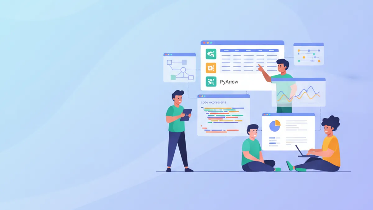
Pandas 3.0 ในปี 2026: API ใหม่, Breaking Changes และคำถามสัมภาษณ์งาน
คู่มือฉบับสมบูรณ์เกี่ยวกับ Pandas 3.0 ครอบคลุม Copy-on-Write, PyArrow string backend, pd.col() expressions, breaking changes และคำถามสัมภาษณ์ data analytics

Top 25 คำถามสัมภาษณ์งาน Data Analytics ที่พบบ่อยที่สุดในปี 2026
เตรียมพร้อมสำหรับคำถามสัมภาษณ์ Data Analytics ในปี 2026 ครอบคลุม SQL, Python พร้อม pandas 3.0 Copy-on-Write, Power BI Direct Lake, สถิติ และคำถามเชิงพฤติกรรม พร้อมคำตอบโดยละเอียดและตัวอย่างโค้ด
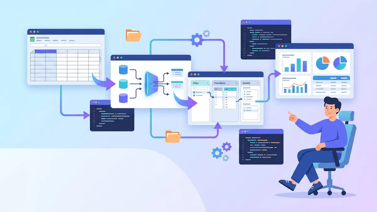
Excel Power Query 2026: ETL สำหรับ Data Analyst และคำถามสัมภาษณ์
คู่มือฉบับสมบูรณ์ Power Query ใน Excel สำหรับ data analyst เรียนรู้การแปลงข้อมูล ETL, ภาษา M, query folding และการเตรียมตัวสัมภาษณ์ทางเทคนิค