SwiftUI: Building Modern Interfaces for iOS
Learn to create modern user interfaces with SwiftUI: declarative syntax, components, animations and best practices for iOS 18.

SwiftUI has transformed interface development across Apple platforms. With its declarative syntax and native integration, this framework lets you build elegant applications with fewer lines of code than ever before. iOS 18 brings major improvements in performance and new capabilities.
SwiftUI is now mature with iOS 18, offering optimized rendering, better memory management, and simplified UIKit integration. It's the standard for new iOS applications.
Understanding the Declarative Paradigm
Before writing code, let's understand what makes SwiftUI different. With UIKit (the older framework), you had to tell iOS how to build the interface step by step: "create a label, position it here, change its color when the user clicks". This is the imperative paradigm.
SwiftUI works differently: you describe what you want to display, and the framework handles the rest. It's like the difference between giving turn-by-turn GPS directions (imperative) and simply stating the destination (declarative).
Your First View
In SwiftUI, every interface element is a View. A View is a struct that describes what should appear on screen. Let's create our first screen with a title, subtitle, and button:
import SwiftUI

// Each screen is a struct that implements the View protocol
struct ContentView: View {

    // The "body" property describes what the view displays
    // "some View" means "a type of View, but Swift figures it out automatically"
    var body: some View {

        // VStack = "Vertical Stack": stacks elements vertically
        // spacing: 20 = 20 points of space between each element
        VStack(spacing: 20) {

            // A simple text with style modifiers
            Text("Welcome to SharpSkill")
                .font(.largeTitle)      // Large title font
                .fontWeight(.bold)      // Bold text

            Text("Prepare for your iOS interviews")
                .font(.subheadline)     // Smaller font
                .foregroundColor(.secondary)  // Gray secondary color

            // Button with an action (closure) and a label
            Button("Get Started") {
                print("Button tapped!")
            }
            .buttonStyle(.borderedProminent)  // Filled blue button style
        }
        .padding()  // Adds margins around the VStack
    }
}
Notice the structure: we declare what we want (texts, button), stack them vertically (VStack), and apply styles via modifiers (.font(), .padding()).
Key takeaway: In SwiftUI, you don't "create" UI objects — you describe the desired interface. SwiftUI handles creating, updating, and destroying the actual elements.
Modifiers: Transforming Your Views
Modifiers are methods you chain after a view to transform it. Think of them like Instagram filters applied one after another. Order matters because each modifier creates a new view that wraps the previous one.
Here's an example illustrating why order is crucial:
// Example 1: padding THEN background
Text("SwiftUI")
    .padding()           // 1. Adds 16pt of space around the text
    .background(.blue)   // 2. Blue background covers text + padding
    .foregroundColor(.white)
// Result: white text on blue rectangle with margins

// Example 2: background THEN padding (reversed order!)
Text("SwiftUI")
    .background(.blue)   // 1. Tight blue background around text only
    .padding()           // 2. Transparent padding around blue background
    .foregroundColor(.white)
// Result: white text on small blue rectangle, surrounded by empty space
The difference? In the first case, padding is "inside" the background. In the second, it's "outside". Subtle but essential for mastering layouts.
Organizing Interfaces with Stacks
SwiftUI offers three main containers for organizing your views. Think of them as boxes that arrange their content differently.
VStack, HStack, and ZStack
- VStack (Vertical Stack): stacks elements from top to bottom
- HStack (Horizontal Stack): aligns elements from left to right
- ZStack (Z-axis Stack): layers elements on top of each other
Let's build a user profile card combining all three stacks. The goal: display a photo with a verification badge, then the user's name and role.
struct ProfileCard: View {
    var body: some View {
        // Main HStack: photo on left, info on right
        HStack(spacing: 16) {

            // ZStack to overlay the badge on the photo
            ZStack(alignment: .bottomTrailing) {
                // Profile image (circle)
                Image("avatar")
                    .resizable()
                    .frame(width: 60, height: 60)
                    .clipShape(Circle())

                // Green "verified" badge at bottom right
                Image(systemName: "checkmark.circle.fill")
                    .foregroundColor(.green)
                    .background(Circle().fill(.white))  // White circle behind
            }

            // VStack to stack name and role vertically
            VStack(alignment: .leading, spacing: 4) {
                Text("Marie Dupont")
                    .font(.headline)

                Text("iOS Developer")
                    .font(.subheadline)
                    .foregroundColor(.secondary)
            }

            // Spacer pushes everything to the left
            Spacer()

            // Chevron on right indicates it's tappable
            Image(systemName: "chevron.right")
                .foregroundColor(.gray)
        }
        .padding()
        .background(Color(.systemGray6))
        .cornerRadius(12)
    }
}
The trick here is Spacer(): it's an invisible element that takes up all available space. Without it, elements would be centered. With it, they're pushed left and the chevron stays pinned to the right.
Use ⌘ + click on any view in Xcode to access the visual inspector. You can add modifiers without typing code!
Managing State with @State and @Binding
State management is SwiftUI's heart. State is any data that can change and should update the interface. When state changes, SwiftUI automatically recalculates affected views.
@State: A View's Local State
@State is a property wrapper that tells SwiftUI: "watch this variable, and refresh the view when it changes". It's perfect for a single view's local state.
Let's create an interactive counter to understand the mechanism:
struct CounterView: View {
    // @State creates a "source of truth" for this view
    // private because state shouldn't be modified from outside
    @State private var count = 0

    var body: some View {
        VStack(spacing: 30) {
            // This Text updates automatically when count changes
            Text("\(count)")
                .font(.system(size: 72, weight: .bold))

            HStack(spacing: 40) {
                // Decrement button
                Button(action: {
                    count -= 1  // Modifies state → view refreshes
                }) {
                    Image(systemName: "minus.circle.fill")
                        .font(.largeTitle)
                }

                // Increment button
                Button(action: {
                    count += 1
                }) {
                    Image(systemName: "plus.circle.fill")
                        .font(.largeTitle)
                }
            }
        }
    }
}
When you tap a button, count changes. SwiftUI detects this change and re-executes body to update the display. You don't have to manually update the label — it's automatic.
@Binding: Sharing State Between Views
Sometimes a child view needs to modify a parent view's state. That's where @Binding comes in: it creates a two-way connection to an existing @State.
Let's look at a concrete example: a username input field with real-time validation.
// Parent view: owns the state
struct SignupForm: View {
    @State private var username = ""       // Source of truth
    @State private var isValid = false     // Validation state

    var body: some View {
        VStack(spacing: 20) {
            // We pass BINDINGS (with $) to the child view
            UsernameField(username: $username, isValid: $isValid)

            Button("Create Account") {
                // Submit the form
            }
            .disabled(!isValid)  // Disabled if invalid
            .buttonStyle(.borderedProminent)
        }
        .padding()
    }
}
The child view receives bindings and can modify them:
// Child view: receives and modifies state via @Binding
struct UsernameField: View {
    @Binding var username: String   // Connection to parent's @State
    @Binding var isValid: Bool

    var body: some View {
        VStack(alignment: .leading, spacing: 8) {
            TextField("Username", text: $username)
                .textFieldStyle(.roundedBorder)
                .onChange(of: username) { oldValue, newValue in
                    // Validation: at least 3 characters
                    isValid = newValue.count >= 3
                }

            // Visual feedback
            HStack {
                Image(systemName: isValid ? "checkmark.circle" : "xmark.circle")
                Text("Minimum 3 characters")
            }
            .font(.caption)
            .foregroundColor(isValid ? .green : .red)
        }
    }
}
When the user types in the TextField, username is modified via the binding. The parent sees this change and can use it. It's clean bidirectional communication.
Only use @State for simple, local state. For data shared across multiple screens or complex logic, prefer @Observable (iOS 17+) or MVVM patterns.
Ready to ace your iOS interviews?
Practice with our interactive simulators, flashcards, and technical tests.
Displaying Dynamic Lists
Lists are everywhere in mobile apps. SwiftUI provides List for displaying data collections with native iOS styling (separators, swipe actions, etc.).
Creating a Simple List
To display a list, you need two things: data and a way to identify it. The Identifiable protocol lets SwiftUI know which view corresponds to which data.
Let's start by defining our data model:
// Identifiable lets SwiftUI track each element
struct Interview: Identifiable {
    let id = UUID()           // Auto-generated unique identifier
    let technology: String
    let difficulty: String
    let questionCount: Int
}
Now let's create the list. The idea is to iterate over our data with ForEach and create a row for each element:
struct InterviewListView: View {
    // Data to display (in reality, this would come from an API)
    @State private var interviews = [
        Interview(technology: "iOS", difficulty: "Intermediate", questionCount: 25),
        Interview(technology: "Android", difficulty: "Advanced", questionCount: 30),
        Interview(technology: "React", difficulty: "Beginner", questionCount: 20)
    ]

    var body: some View {
        // NavigationStack enables the navigation bar
        NavigationStack {
            List {
                // ForEach iterates over each interview
                // Thanks to Identifiable, no need to specify id:
                ForEach(interviews) { interview in
                    InterviewRow(interview: interview)
                }
            }
            .navigationTitle("My Interviews")
        }
    }
}
And here's the view for each row, extracted into its own component for clarity:
struct InterviewRow: View {
    let interview: Interview

    var body: some View {
        HStack {
            // Left column: title and subtitle
            VStack(alignment: .leading, spacing: 4) {
                Text(interview.technology)
                    .font(.headline)

                Text(interview.difficulty)
                    .font(.subheadline)
                    .foregroundColor(.secondary)
            }

            Spacer()

            // Badge with question count
            Text("\(interview.questionCount) Q")
                .font(.caption)
                .fontWeight(.medium)
                .padding(.horizontal, 8)
                .padding(.vertical, 4)
                .background(Color.blue.opacity(0.1))
                .cornerRadius(8)
        }
        .padding(.vertical, 4)
    }
}
By extracting InterviewRow into its own struct, the code is more readable and reusable. This is a SwiftUI best practice.
Adding Actions: Delete and Reorder
iOS lists naturally support delete (swipe left) and reorder (drag and drop). SwiftUI makes this trivial with .onDelete and .onMove:
struct InterviewListView: View {
    @State private var interviews = [/* ... data ... */]

    var body: some View {
        NavigationStack {
            List {
                ForEach(interviews) { interview in
                    InterviewRow(interview: interview)
                }
                // Swipe to delete
                .onDelete(perform: deleteInterview)
                // Drag and drop to reorder
                .onMove(perform: moveInterview)
            }
            .navigationTitle("My Interviews")
            .toolbar {
                // "Edit" button that activates edit mode
                EditButton()
            }
        }
    }

    // Deletes elements at specified indices
    private func deleteInterview(at offsets: IndexSet) {
        interviews.remove(atOffsets: offsets)
    }

    // Moves elements from one position to another
    private func moveInterview(from source: IndexSet, to destination: Int) {
        interviews.move(fromOffsets: source, toOffset: destination)
    }
}
With just 4 extra lines of code (.onDelete, .onMove, EditButton, and the two functions), you have a fully interactive list. That's SwiftUI magic.
Animating Your Interfaces
SwiftUI excels at animations. Unlike UIKit where animations required lots of code, here everything is declarative: you describe the final state and SwiftUI animates the transition.
Implicit Animations with withAnimation
The simplest way to animate is wrapping a state change in withAnimation. SwiftUI detects what changes and automatically animates affected visual properties.
struct AnimatedCard: View {
    @State private var isExpanded = false

    var body: some View {
        VStack {
            RoundedRectangle(cornerRadius: 20)
                .fill(.blue)
                // Dimensions change based on state
                .frame(
                    width: isExpanded ? 300 : 150,
                    height: isExpanded ? 200 : 100
                )

            Button(isExpanded ? "Collapse" : "Expand") {
                // withAnimation animates ALL visual changes
                // resulting from this state change
                withAnimation(.spring(response: 0.5, dampingFraction: 0.7)) {
                    isExpanded.toggle()
                }
            }
            .padding(.top)
        }
    }
}
When you tap the button, isExpanded toggles. Thanks to withAnimation, the rectangle's size change is animated with a spring effect. You don't have to specify what to animate — SwiftUI figures it out.
Transitions: Animating Appearance/Disappearance
Transitions define how a view appears or disappears. By default, it's a fade (opacity), but you can customize:
struct TransitionDemo: View {
    @State private var showDetails = false

    var body: some View {
        VStack(spacing: 20) {
            Button("Show Details") {
                withAnimation(.easeInOut(duration: 0.3)) {
                    showDetails.toggle()
                }
            }

            // This view appears/disappears with a transition
            if showDetails {
                DetailCard()
                    // Asymmetric transition: different for entry and exit
                    .transition(
                        .asymmetric(
                            insertion: .scale.combined(with: .opacity),  // Entry: zoom + fade
                            removal: .slide                               // Exit: slide
                        )
                    )
            }
        }
    }
}

struct DetailCard: View {
    var body: some View {
        VStack(alignment: .leading, spacing: 12) {
            Text("Interview Details")
                .font(.headline)
            Text("25 questions • 45 minutes")
                .foregroundColor(.secondary)
        }
        .padding()
        .background(Color(.systemGray6))
        .cornerRadius(16)
    }
}
Here, the card appears by zooming from center (scale + opacity) and disappears by sliding sideways (slide). These micro-animations make the interface feel alive and professional.
SwiftUI automatically optimizes animations. Prefer .spring() for natural feel, and avoid overly long animations (> 0.5s) that frustrate users.
Loading Asynchronous Data
In real applications, your data often comes from an API. Swift Concurrency (async/await) integrates perfectly with SwiftUI through the .task modifier.
The Loading / Error / Success Pattern
Here's the standard pattern for displaying API data. We handle three states: loading, error, and success.
struct AsyncDataView: View {
    @State private var questions: [Question] = []
    @State private var isLoading = true
    @State private var errorMessage: String?

    var body: some View {
        Group {
            if isLoading {
                // State: loading in progress
                ProgressView("Loading...")

            } else if let error = errorMessage {
                // State: error
                VStack(spacing: 16) {
                    Image(systemName: "exclamationmark.triangle")
                        .font(.largeTitle)
                        .foregroundColor(.orange)
                    Text(error)
                    Button("Retry") {
                        Task { await loadQuestions() }
                    }
                }

            } else {
                // State: success, display data
                List(questions) { question in
                    Text(question.title)
                }
            }
        }
        // .task runs automatically when the view appears
        .task {
            await loadQuestions()
        }
        // Pull-to-refresh
        .refreshable {
            await loadQuestions()
        }
    }

    private func loadQuestions() async {
        isLoading = true
        errorMessage = nil

        do {
            // Async API call
            questions = try await QuestionService.shared.fetchQuestions()
        } catch {
            errorMessage = "Unable to load questions"
        }

        isLoading = false
    }
}
The .task modifier is essential: it launches an async task when the view appears and automatically cancels it when it disappears. No memory leaks possible.
Conclusion
SwiftUI has become essential for modern iOS development. With iOS 18, the framework has reached a maturity that makes it perfectly suited for production applications.
Key Takeaways
- Declarative paradigm: describe what you want, not how to build it
- @State and @Binding: manage state reactively and propagate it between views
- Stacks: combine VStack, HStack, and ZStack for flexible layouts
- List: display collections with minimal code and native interactions
- Animations: use
withAnimationfor automatic smooth transitions - Async/await: load your data with
.taskand handle loading/error states
Checklist
- ✅ Understand the difference between imperative (UIKit) and declarative (SwiftUI)
- ✅ Master modifiers and their application order
- ✅ Know when to use @State vs @Binding vs @Observable
- ✅ Build layouts with Stacks
- ✅ Implement lists with actions (delete, move)
- ✅ Animate state changes with withAnimation
Start practicing!
Test your knowledge with our interview simulators and technical tests.
SwiftUI opens the doors to building elegant applications across the entire Apple ecosystem. The best way to learn is to practice: create a small personal project and experiment with each concept from this article!
Tags
Share
Related articles
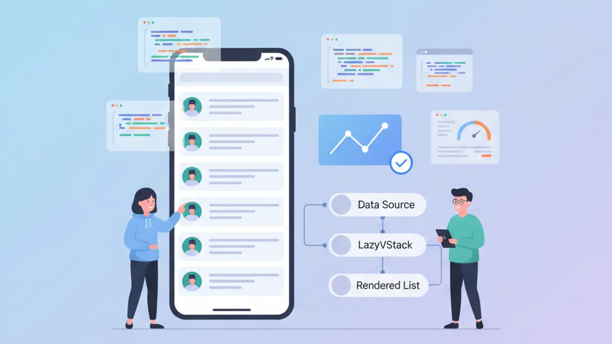
SwiftUI Performance: Optimizing LazyVStack and Complex Lists
Optimization techniques for LazyVStack and SwiftUI lists. Reduce memory consumption, improve scrolling performance, and avoid common pitfalls.

SwiftUI Custom ViewModifiers: Reusable Patterns for Design Systems
Build custom SwiftUI ViewModifiers for a consistent design system. Patterns, best practices, and practical examples to style iOS views efficiently.

SwiftUI @Observable vs @State: When to Use What in 2026
Master the differences between @Observable and @State in SwiftUI to choose the right state management tool for your iOS applications.