SwiftUI:iOSのモダンなインターフェース構築ガイド
SwiftUIを使ったモダンなUIの構築方法を解説します。宣言的構文、コンポーネント、アニメーション、iOS 18のベストプラクティスを網羅しています。

SwiftUIはAppleプラットフォームにおけるインターフェース開発を根本から変革しました。宣言的な構文とネイティブな統合により、従来よりも少ないコードで洗練されたアプリケーションを構築できます。iOS 18ではパフォーマンスの大幅な向上と新機能が導入されています。
SwiftUIはiOS 18で成熟期を迎えました。レンダリングの最適化、メモリ管理の改善、UIKitとの統合の簡素化が実現されており、新規iOSアプリケーション開発の標準となっています。
宣言的パラダイムを理解する
コードを書く前に、SwiftUIの本質的な特徴を把握しておく必要があります。UIKit(従来のフレームワーク)では、インターフェースの構築手順を一つずつ指示する必要がありました。「ラベルを作成し、ここに配置し、ユーザーがクリックしたら色を変える」といった具合です。これが命令的パラダイムです。
SwiftUIのアプローチは異なります。表示したい内容を記述するだけで、フレームワークが残りの処理を担当します。カーナビで一つずつ道順を指示する(命令的)か、目的地だけを伝える(宣言的)かの違いに似ています。
最初のビューを作成する
SwiftUIでは、すべてのインターフェース要素はViewです。Viewは画面に表示される内容を記述するstructです。タイトル、サブタイトル、ボタンを含む最初の画面を作成してみましょう。
import SwiftUI

// Each screen is a struct that implements the View protocol
struct ContentView: View {

    // The "body" property describes what the view displays
    // "some View" means "a type of View, but Swift figures it out automatically"
    var body: some View {

        // VStack = "Vertical Stack": stacks elements vertically
        // spacing: 20 = 20 points of space between each element
        VStack(spacing: 20) {

            // A simple text with style modifiers
            Text("Welcome to SharpSkill")
                .font(.largeTitle)      // Large title font
                .fontWeight(.bold)      // Bold text

            Text("Prepare for your iOS interviews")
                .font(.subheadline)     // Smaller font
                .foregroundColor(.secondary)  // Gray secondary color

            // Button with an action (closure) and a label
            Button("Get Started") {
                print("Button tapped!")
            }
            .buttonStyle(.borderedProminent)  // Filled blue button style
        }
        .padding()  // Adds margins around the VStack
    }
}この構造を確認してください。表示したいもの(テキスト、ボタン)を宣言し、縦に並べ(VStack)、モディファイア(.font()、.padding())でスタイルを適用しています。
重要なポイント:SwiftUIでは、UIオブジェクトを「作成」するのではなく、望むインターフェースを記述します。実際の要素の生成、更新、破棄はSwiftUIが処理します。
モディファイア:ビューの変換
モディファイアは、ビューの後にチェーンして変換を適用するメソッドです。Instagramのフィルターを順番に適用するようなものと考えてください。順序が重要です。各モディファイアは前のビューをラップする新しいビューを作成するためです。
順序がなぜ重要かを示す例を見てみましょう。
// Example 1: padding THEN background
Text("SwiftUI")
    .padding()           // 1. Adds 16pt of space around the text
    .background(.blue)   // 2. Blue background covers text + padding
    .foregroundColor(.white)
// Result: white text on blue rectangle with margins

// Example 2: background THEN padding (reversed order!)
Text("SwiftUI")
    .background(.blue)   // 1. Tight blue background around text only
    .padding()           // 2. Transparent padding around blue background
    .foregroundColor(.white)
// Result: white text on small blue rectangle, surrounded by empty space
違いは明確です。最初の例ではpaddingが背景の「内側」にあり、2番目では「外側」にあります。微妙な違いですが、レイアウトを正確に制御するために不可欠な知識です。
Stackを使ったインターフェースの整理
SwiftUIにはビューを整理するための3つの主要コンテナがあります。コンテンツを異なる方法で配置するボックスと考えてください。
VStack、HStack、ZStack
- VStack(Vertical Stack):要素を上から下に積み重ねます
- HStack(Horizontal Stack):要素を左から右に並べます
- ZStack(Z軸Stack):要素を重ねて配置します
3つのStackすべてを組み合わせて、ユーザープロフィールカードを構築してみましょう。写真に認証バッジを重ね、その横にユーザー名と役職を表示します。
struct ProfileCard: View {
    var body: some View {
        // Main HStack: photo on left, info on right
        HStack(spacing: 16) {

            // ZStack to overlay the badge on the photo
            ZStack(alignment: .bottomTrailing) {
                // Profile image (circle)
                Image("avatar")
                    .resizable()
                    .frame(width: 60, height: 60)
                    .clipShape(Circle())

                // Green "verified" badge at bottom right
                Image(systemName: "checkmark.circle.fill")
                    .foregroundColor(.green)
                    .background(Circle().fill(.white))  // White circle behind
            }

            // VStack to stack name and role vertically
            VStack(alignment: .leading, spacing: 4) {
                Text("Marie Dupont")
                    .font(.headline)

                Text("iOS Developer")
                    .font(.subheadline)
                    .foregroundColor(.secondary)
            }

            // Spacer pushes everything to the left
            Spacer()

            // Chevron on right indicates it's tappable
            Image(systemName: "chevron.right")
                .foregroundColor(.gray)
        }
        .padding()
        .background(Color(.systemGray6))
        .cornerRadius(12)
    }
}ここでのポイントはSpacer()です。利用可能なスペースをすべて占有する不可視の要素です。Spacerがなければ要素は中央に配置されますが、Spacerを使うことで要素が左に押し出され、シェブロンが右端に固定されます。
Xcodeで任意のビューを⌘ + クリックすると、ビジュアルインスペクタにアクセスできます。コードを入力せずにモディファイアを追加することが可能です。
@Stateと@Bindingによる状態管理
状態管理はSwiftUIの核心です。状態とは、変化する可能性があり、インターフェースを更新すべきデータのことです。状態が変化すると、SwiftUIは影響を受けるビューを自動的に再計算します。
@State:ビューのローカル状態
@Stateはプロパティラッパーで、SwiftUIに「この変数を監視し、変更があったらビューを更新してください」と伝えます。単一のビューのローカル状態に最適です。
インタラクティブなカウンターを作成して、仕組みを理解しましょう。
struct CounterView: View {
    // @State creates a "source of truth" for this view
    // private because state shouldn't be modified from outside
    @State private var count = 0

    var body: some View {
        VStack(spacing: 30) {
            // This Text updates automatically when count changes
            Text("\(count)")
                .font(.system(size: 72, weight: .bold))

            HStack(spacing: 40) {
                // Decrement button
                Button(action: {
                    count -= 1  // Modifies state → view refreshes
                }) {
                    Image(systemName: "minus.circle.fill")
                        .font(.largeTitle)
                }

                // Increment button
                Button(action: {
                    count += 1
                }) {
                    Image(systemName: "plus.circle.fill")
                        .font(.largeTitle)
                }
            }
        }
    }
}ボタンをタップするとcountが変化します。SwiftUIはこの変更を検知し、bodyを再実行して表示を更新します。ラベルを手動で更新する必要はありません。すべて自動的に処理されます。
@Binding:ビュー間で状態を共有する
子ビューが親ビューの状態を変更する必要がある場合があります。そこで@Bindingの出番です。既存の@Stateへの双方向接続を作成します。
具体的な例として、リアルタイムバリデーション付きのユーザー名入力フィールドを見てみましょう。
// Parent view: owns the state
struct SignupForm: View {
    @State private var username = ""       // Source of truth
    @State private var isValid = false     // Validation state

    var body: some View {
        VStack(spacing: 20) {
            // We pass BINDINGS (with $) to the child view
            UsernameField(username: $username, isValid: $isValid)

            Button("Create Account") {
                // Submit the form
            }
            .disabled(!isValid)  // Disabled if invalid
            .buttonStyle(.borderedProminent)
        }
        .padding()
    }
}
子ビューはバインディングを受け取り、変更を加えることができます。
// Child view: receives and modifies state via @Binding
struct UsernameField: View {
    @Binding var username: String   // Connection to parent's @State
    @Binding var isValid: Bool

    var body: some View {
        VStack(alignment: .leading, spacing: 8) {
            TextField("Username", text: $username)
                .textFieldStyle(.roundedBorder)
                .onChange(of: username) { oldValue, newValue in
                    // Validation: at least 3 characters
                    isValid = newValue.count >= 3
                }

            // Visual feedback
            HStack {
                Image(systemName: isValid ? "checkmark.circle" : "xmark.circle")
                Text("Minimum 3 characters")
            }
            .font(.caption)
            .foregroundColor(isValid ? .green : .red)
        }
    }
}ユーザーがTextFieldに入力すると、usernameがバインディングを通じて変更されます。親ビューはこの変更を認識し、利用することができます。クリーンな双方向通信が実現されています。
@Stateは単純なローカル状態にのみ使用してください。複数の画面にまたがるデータや複雑なロジックには、@Observable(iOS 17以降)やMVVMパターンの採用を推奨します。
iOSの面接対策はできていますか?
インタラクティブなシミュレーター、flashcards、技術テストで練習しましょう。
動的リストの表示
リストはモバイルアプリの至る所に存在します。SwiftUIはListを提供しており、ネイティブなiOSスタイリング(セパレーター、スワイプアクションなど)を備えたデータコレクションを表示できます。
シンプルなリストの作成
リストを表示するには、データとそれを識別する方法の2つが必要です。Identifiableプロトコルにより、SwiftUIはどのビューがどのデータに対応するかを把握できます。
まず、データモデルを定義します。
// Identifiable lets SwiftUI track each element
struct Interview: Identifiable {
    let id = UUID()           // Auto-generated unique identifier
    let technology: String
    let difficulty: String
    let questionCount: Int
}次にリストを作成します。ForEachでデータを反復処理し、各要素に対して行を生成します。
struct InterviewListView: View {
    // Data to display (in reality, this would come from an API)
    @State private var interviews = [
        Interview(technology: "iOS", difficulty: "Intermediate", questionCount: 25),
        Interview(technology: "Android", difficulty: "Advanced", questionCount: 30),
        Interview(technology: "React", difficulty: "Beginner", questionCount: 20)
    ]

    var body: some View {
        // NavigationStack enables the navigation bar
        NavigationStack {
            List {
                // ForEach iterates over each interview
                // Thanks to Identifiable, no need to specify id:
                ForEach(interviews) { interview in
                    InterviewRow(interview: interview)
                }
            }
            .navigationTitle("My Interviews")
        }
    }
}
各行のビューを独立したコンポーネントとして抽出します。可読性と再利用性が向上します。
struct InterviewRow: View {
    let interview: Interview

    var body: some View {
        HStack {
            // Left column: title and subtitle
            VStack(alignment: .leading, spacing: 4) {
                Text(interview.technology)
                    .font(.headline)

                Text(interview.difficulty)
                    .font(.subheadline)
                    .foregroundColor(.secondary)
            }

            Spacer()

            // Badge with question count
            Text("\(interview.questionCount) Q")
                .font(.caption)
                .fontWeight(.medium)
                .padding(.horizontal, 8)
                .padding(.vertical, 4)
                .background(Color.blue.opacity(0.1))
                .cornerRadius(8)
        }
        .padding(.vertical, 4)
    }
}InterviewRowを独立したstructに抽出することで、コードの可読性と再利用性が大幅に向上します。これはSwiftUIのベストプラクティスです。
アクションの追加:削除と並べ替え
iOSのリストは、削除(左スワイプ)と並べ替え(ドラッグ&ドロップ)をネイティブにサポートしています。SwiftUIでは.onDeleteと.onMoveで簡単に実装できます。
struct InterviewListView: View {
    @State private var interviews = [/* ... data ... */]

    var body: some View {
        NavigationStack {
            List {
                ForEach(interviews) { interview in
                    InterviewRow(interview: interview)
                }
                // Swipe to delete
                .onDelete(perform: deleteInterview)
                // Drag and drop to reorder
                .onMove(perform: moveInterview)
            }
            .navigationTitle("My Interviews")
            .toolbar {
                // "Edit" button that activates edit mode
                EditButton()
            }
        }
    }

    // Deletes elements at specified indices
    private func deleteInterview(at offsets: IndexSet) {
        interviews.remove(atOffsets: offsets)
    }

    // Moves elements from one position to another
    private func moveInterview(from source: IndexSet, to destination: Int) {
        interviews.move(fromOffsets: source, toOffset: destination)
    }
}わずか4行の追加コード(.onDelete、.onMove、EditButton、2つの関数)で、完全にインタラクティブなリストが完成します。SwiftUIの真価がここに表れています。
インターフェースのアニメーション
SwiftUIはアニメーションにおいて優れた性能を発揮します。UIKitでは大量のコードが必要だったアニメーションも、ここではすべて宣言的に記述できます。最終状態を記述するだけで、SwiftUIがトランジションを処理します。
withAnimationによる暗黙的アニメーション
アニメーションの最も簡単な方法は、状態の変更をwithAnimationでラップすることです。SwiftUIが変更箇所を検知し、影響を受けるビジュアルプロパティを自動的にアニメーションさせます。
struct AnimatedCard: View {
    @State private var isExpanded = false

    var body: some View {
        VStack {
            RoundedRectangle(cornerRadius: 20)
                .fill(.blue)
                // Dimensions change based on state
                .frame(
                    width: isExpanded ? 300 : 150,
                    height: isExpanded ? 200 : 100
                )

            Button(isExpanded ? "Collapse" : "Expand") {
                // withAnimation animates ALL visual changes
                // resulting from this state change
                withAnimation(.spring(response: 0.5, dampingFraction: 0.7)) {
                    isExpanded.toggle()
                }
            }
            .padding(.top)
        }
    }
}ボタンをタップするとisExpandedが切り替わります。withAnimationのおかげで、矩形のサイズ変更がスプリングエフェクトでアニメーションされます。何をアニメーションすべきかを指定する必要はありません。SwiftUIが自動的に判断します。
トランジション:表示と非表示のアニメーション
トランジションは、ビューがどのように表示・非表示になるかを定義します。デフォルトではフェード(opacity)ですが、カスタマイズが可能です。
struct TransitionDemo: View {
    @State private var showDetails = false

    var body: some View {
        VStack(spacing: 20) {
            Button("Show Details") {
                withAnimation(.easeInOut(duration: 0.3)) {
                    showDetails.toggle()
                }
            }

            // This view appears/disappears with a transition
            if showDetails {
                DetailCard()
                    // Asymmetric transition: different for entry and exit
                    .transition(
                        .asymmetric(
                            insertion: .scale.combined(with: .opacity),  // Entry: zoom + fade
                            removal: .slide                               // Exit: slide
                        )
                    )
            }
        }
    }
}

struct DetailCard: View {
    var body: some View {
        VStack(alignment: .leading, spacing: 12) {
            Text("Interview Details")
                .font(.headline)
            Text("25 questions • 45 minutes")
                .foregroundColor(.secondary)
        }
        .padding()
        .background(Color(.systemGray6))
        .cornerRadius(16)
    }
}
この例では、カードは中央からズームイン(scale + opacity)で表示され、横にスライド(slide)して非表示になります。こうしたマイクロアニメーションが、インターフェースに生命感とプロフェッショナルな印象を与えます。
SwiftUIはアニメーションを自動的に最適化します。自然な動きには.spring()を使用し、ユーザーにストレスを与える長すぎるアニメーション(0.5秒超)は避けてください。
非同期データの読み込み
実際のアプリケーションでは、データはAPIから取得することがほとんどです。Swift Concurrency(async/await)は.taskモディファイアを通じてSwiftUIとシームレスに統合されています。
Loading / Error / Success パターン
APIデータを表示するための標準パターンを紹介します。ローディング中、エラー、成功の3つの状態を処理します。
struct AsyncDataView: View {
    @State private var questions: [Question] = []
    @State private var isLoading = true
    @State private var errorMessage: String?

    var body: some View {
        Group {
            if isLoading {
                // State: loading in progress
                ProgressView("Loading...")

            } else if let error = errorMessage {
                // State: error
                VStack(spacing: 16) {
                    Image(systemName: "exclamationmark.triangle")
                        .font(.largeTitle)
                        .foregroundColor(.orange)
                    Text(error)
                    Button("Retry") {
                        Task { await loadQuestions() }
                    }
                }

            } else {
                // State: success, display data
                List(questions) { question in
                    Text(question.title)
                }
            }
        }
        // .task runs automatically when the view appears
        .task {
            await loadQuestions()
        }
        // Pull-to-refresh
        .refreshable {
            await loadQuestions()
        }
    }

    private func loadQuestions() async {
        isLoading = true
        errorMessage = nil

        do {
            // Async API call
            questions = try await QuestionService.shared.fetchQuestions()
        } catch {
            errorMessage = "Unable to load questions"
        }

        isLoading = false
    }
}.taskモディファイアは不可欠です。ビューが表示されると非同期タスクを起動し、ビューが消えると自動的にキャンセルします。メモリリークの心配がありません。
まとめ
SwiftUIはモダンなiOS開発において必要不可欠な存在となりました。iOS 18により、プロダクション環境のアプリケーションに十分な成熟度に達しています。
要点の整理
- 宣言的パラダイム:構築方法ではなく、表示したい内容を記述する
- @Stateと@Binding:状態をリアクティブに管理し、ビュー間で伝達する
- Stack:VStack、HStack、ZStackを組み合わせて柔軟なレイアウトを構築する
- List:最小限のコードでネイティブなインタラクションを備えたコレクションを表示する
- アニメーション:
withAnimationでスムーズな自動トランジションを実現する - Async/await:
.taskでデータを読み込み、ローディングやエラー状態を処理する
チェックリスト
- 命令的(UIKit)と宣言的(SwiftUI)の違いを理解している
- モディファイアとその適用順序を習得している
- @State、@Binding、@Observableの使い分けを把握している
- Stackを使ったレイアウト構築ができる
- アクション付きリスト(削除、移動)を実装できる
- withAnimationを使った状態変更のアニメーションを適用できる
今すぐ練習を始めましょう!
面接シミュレーターと技術テストで知識をテストしましょう。
SwiftUIは、Appleエコシステム全体にわたる洗練されたアプリケーション構築への道を開きます。最良の学習方法は実践です。小さな個人プロジェクトを作成し、この記事で紹介した各コンセプトを試してみてください。
タグ
共有
関連記事
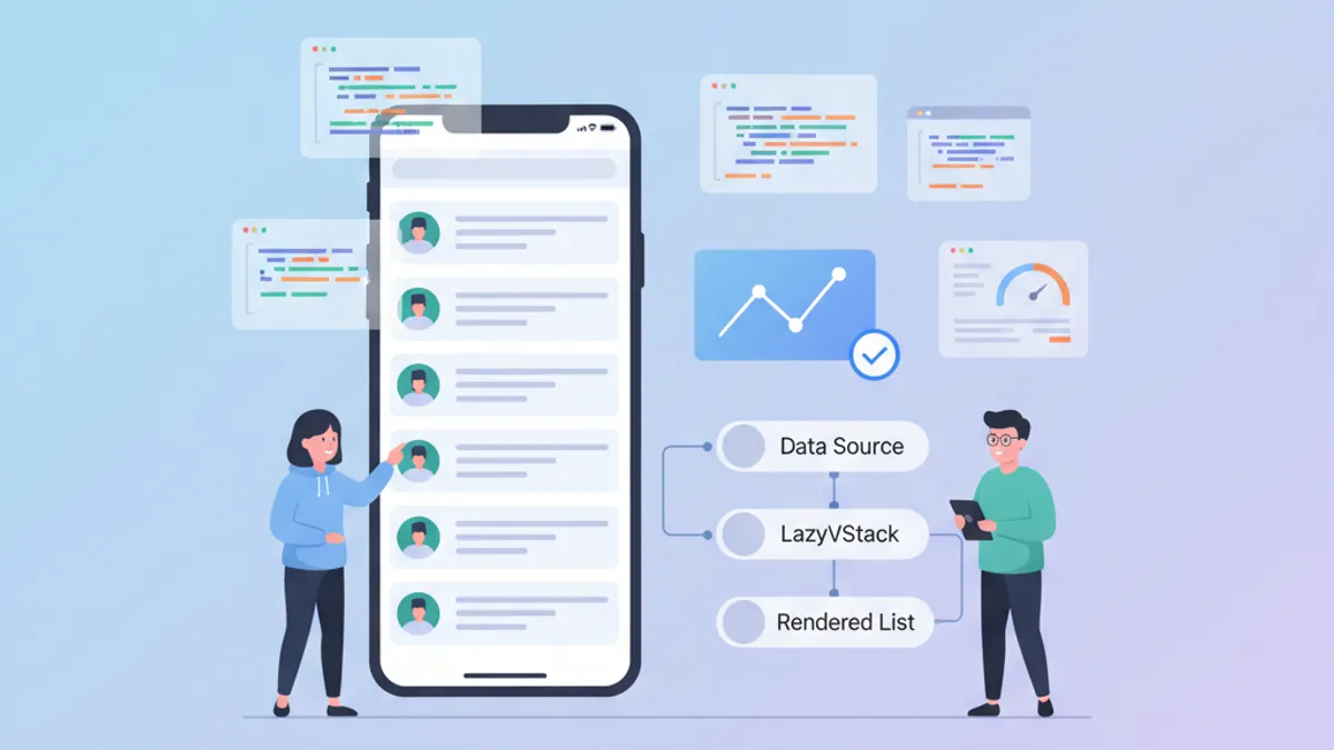
SwiftUIパフォーマンス:LazyVStackと複雑なリストの最適化
LazyVStackとSwiftUIリストの最適化テクニック。メモリ消費を削減し、スクロールパフォーマンスを向上させ、よくある落とし穴を回避します。

SwiftUIカスタムViewModifier:デザインシステム向け再利用可能パターン
一貫したデザインシステムのためにSwiftUIでカスタムViewModifierを構築します。iOSビューを効率的にスタイリングするためのパターン、ベストプラクティス、実用的な例を紹介します。

SwiftUI @Observable vs @State: 2026年にどちらをいつ使うか
SwiftUIにおける@Observableと@Stateの違いを理解し、iOSアプリに最適な状態管理ツールを選択しましょう。